COVID-19 Traffic
COVID-19 vehicular traffic viz
As of writing this, COVID-19 has become a big deal worldwide and has disrupted life for everyone.
I was going through a bunch of news articles highlighting this fact, and also came across a whole lot of images showing empty streets, no traffic jams, ghost town-like scenarios, and all such post-apocalyptia. I began wondering how this would show up in satellite images (which naturally won’t appear too different), and subsequently how traffic patterns would look when viewed in real time, as I was used to seeing through Google Maps.
For a start, I checked the live traffic status for some cities notorious for their traffic jams.
Take Milan, for instance.
| Traffic during COVID-19 | Peak traffic, typically |
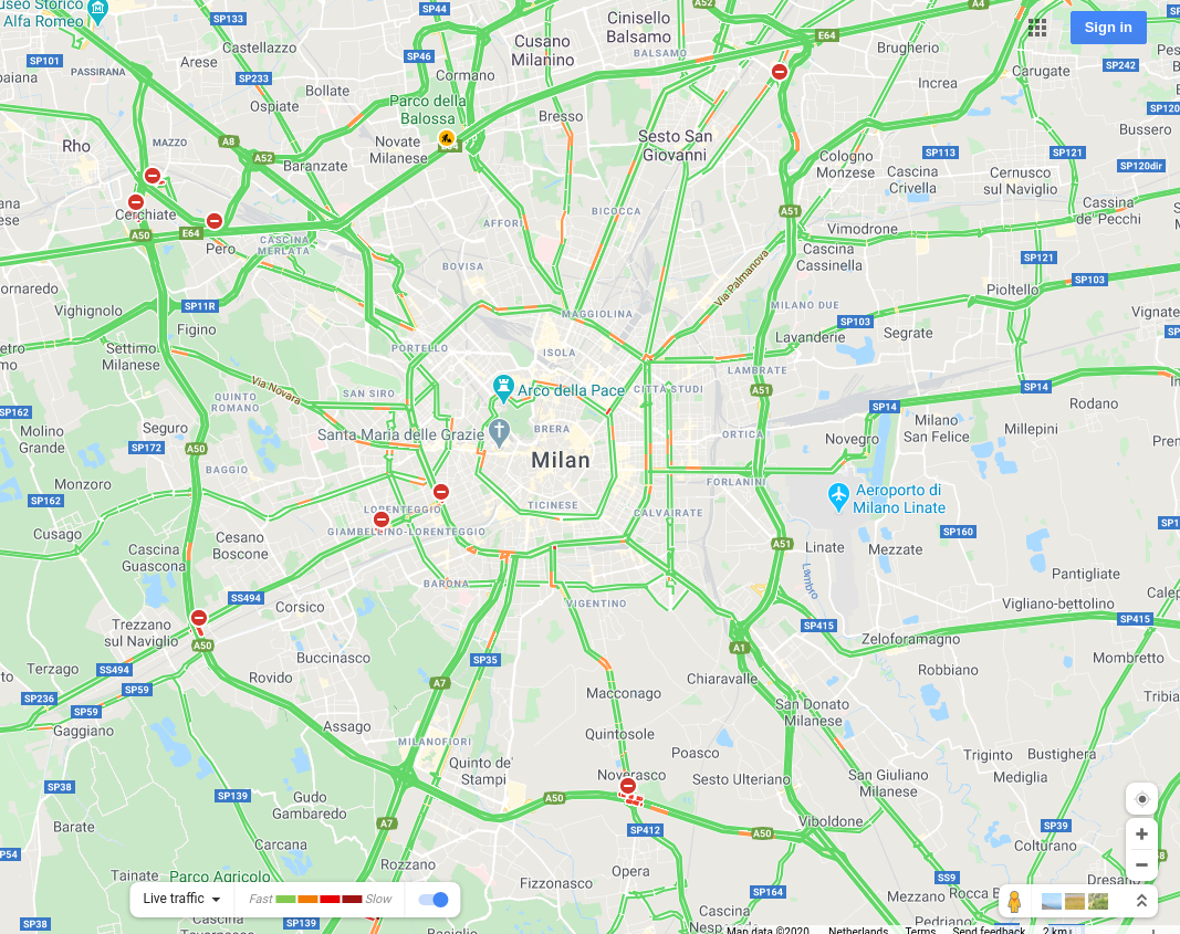 |
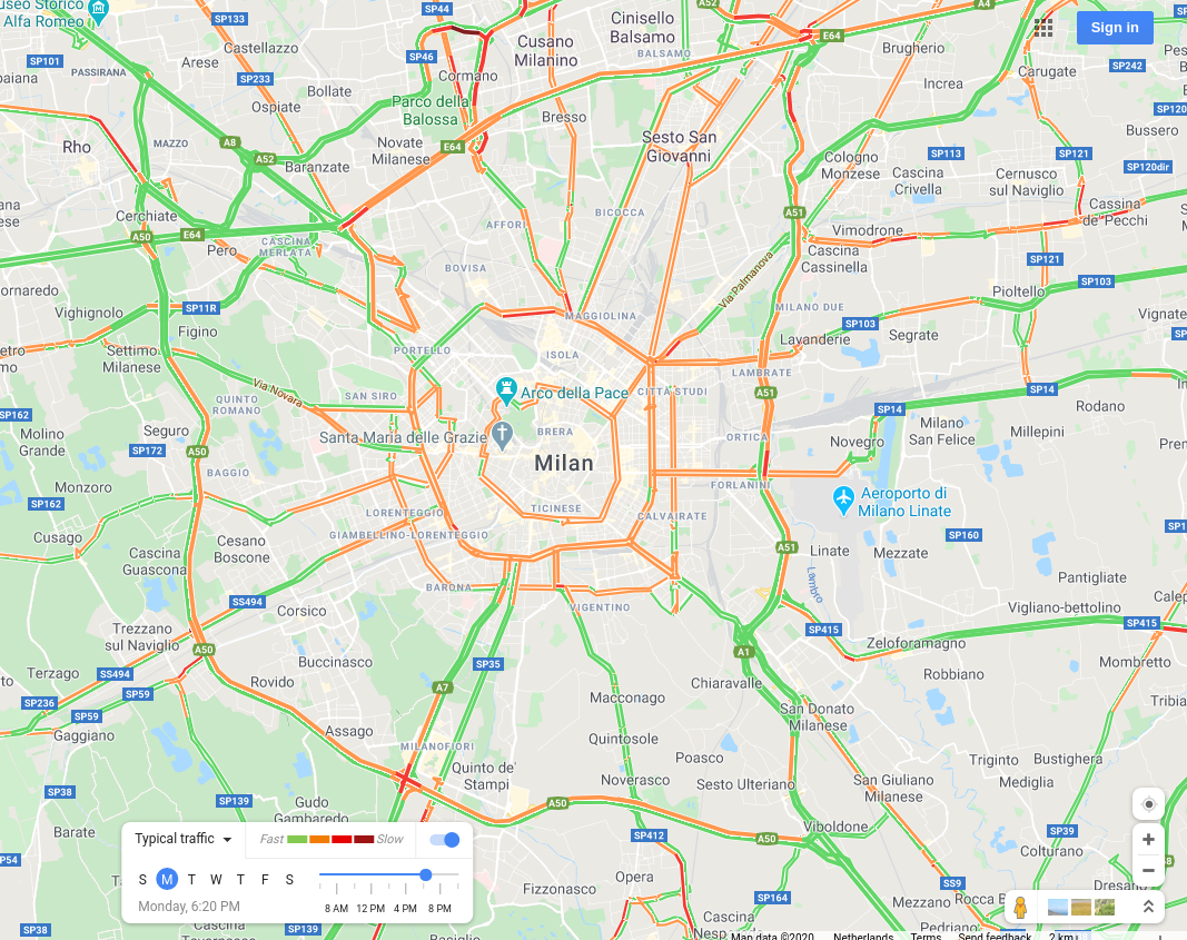 |
A city that would typically look jam-packed with vehicles at peak hours (as on the right) showed up completely devoid of traffic, if the map on the left were anything to go by.
Being a student at a technical university, and having “looking at city maps for joy” as a hobby, I started wondering how various cities around the world would look like during these times of crisis, and more importantly, how I could automate the process.
Though I knew what browser automation was, and knew of Selenium’s existence, I hadn’t done anything about it. So I thought I’d make use of this opportunity, being locked up in my house, to go through some docs and API references to get something done.
The end result was a couple of scripts that automatically open Google Maps in a browser window, navigate to various cities, and capture images showing “live traffic” and “typical traffic” at peak hours. A comparison of those images shows how much of an impact COVID-19 has had on cities all around the world!
Check out the project repository here. Instructions on how to run the scripts can be found in the README file. You can customize which cities you’d want to compare!
I ran the scripts to get images for a whole bunch of cities. The results of this project can be found on the main blog page.